01
Connection Uncertainty
Users were unsure which available machine or connection represented the correct destination.
This desktop tool helps developers, embedded engineers, and technical operators establish Ethernet communication between systems and transfer files reliably. The design challenge was not to hide technical complexity altogether, but to present the right information at the right moment—so users could focus on connecting, selecting a destination, and transferring data rather than interpreting networking concepts first.
File transfer was technically possible, but the experience made a simple task feel unnecessarily complex.
In industrial testing and embedded-system environments, teams often need to transfer files directly between machines without relying on internet connectivity.
Although the underlying networking technology was reliable, the interface exposed too much technical complexity at the wrong moment. Users had to interpret connections, destinations, transfer states, and failures before they could confidently complete a simple file-transfer task.
Direct machine-to-machine communication in controlled industrial environments.
Connect, select a destination, transfer files, and verify completion.
Reduce technical interpretation without hiding important system information.
Users were unsure which available machine or connection represented the correct destination.
During large transfers, users lacked a clear understanding of what was happening and whether the process was progressing.
When something failed, users needed clearer feedback about what went wrong and what action they should take next.
It was a mental-model mismatch. The system communicated how the technology worked, while users primarily needed to understand what they needed to do next.
The research combined informal user discussions, workflow analysis, and review of the existing experience to identify friction points. Rather than measuring quantitative outcomes, the study focused on understanding what users needed to know at each step to make confident decisions. This helped identify where technical information could be simplified, prioritized, or moved into secondary layers.
The experience needed to work for both technically experienced engineers and operators who interact with the system primarily to complete a task.
“I want to connect, transfer confidently, and confirm completion.”
“I want to know what to select, what is happening, and what to do next.”
How might we simplify Ethernet communication for tech/non-tech users by reducing setup complexity, improving system visibility, and creating confidence during file transfers?
Across both user types, the same underlying pattern emerged: users didn't need more technical information. They needed the right information at the right moment.
Experienced users understood networking concepts, but still had to interpret which interface was relevant to their immediate task.
Reduce the gap between system complexity and user intent.
Knowing that an adapter exists is different from knowing whether it can currently support the intended communication.
Make connection state actionable instead of presenting it as passive system metadata.
File transfer is consequential. Users need confidence in both the selected files and their destination.
Make source and destination identity explicit before the transfer begins.
Technical exceptions can explain what went wrong without helping users understand what to do next.
Turn error messages into actionable recovery guidance instead of passive failure reports.
The interface should guide users through the minimum information required at each stage, while keeping deeper technical details available when they need them.
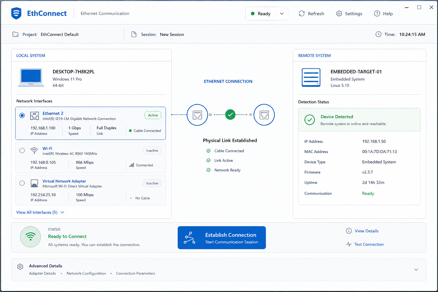
Surface available devices and connection states without requiring users to understand networking terminology first.
Make destination identity, device state, and transfer context explicit before an action is taken.
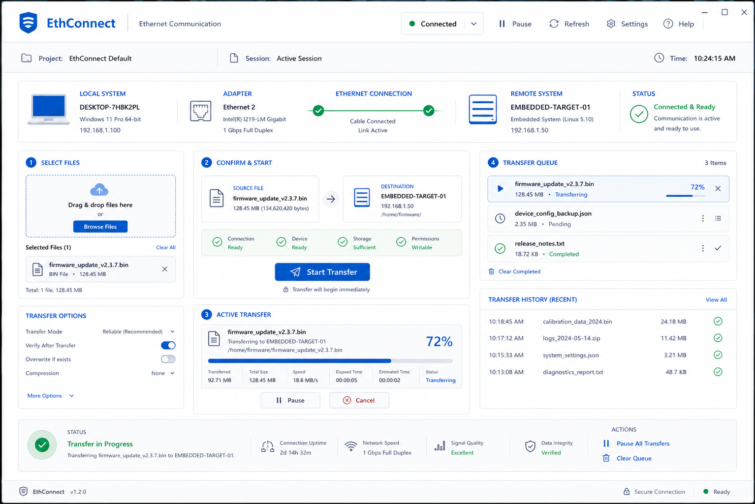
Provide clear progress, completion feedback, and actionable recovery when something goes wrong.
Instead of exposing networking concepts first, I reorganized the experience around what users actually needed to accomplish: detect → select → transfer.
These principles translated the research findings into concrete interaction decisions throughout the product.
Show the information users need to complete the current task first. Keep technical details such as IP addresses and adapter names accessible without making them the primary focus.
Less upfront complexityMake the system state continuously understandable: available, connected, transferring, completed, or requiring attention.
Always know what's happeningHelp users recognize available devices, destinations, and actions rather than asking them to remember technical information or system terminology.
See it → understand it → actPrevent incorrect actions before they happen by clearly communicating device availability, destination identity, and transfer requirements.
Prevent before explainingWhen something fails, explain what happened, why it matters, and what the user can do next instead of leaving them with a technical error message.
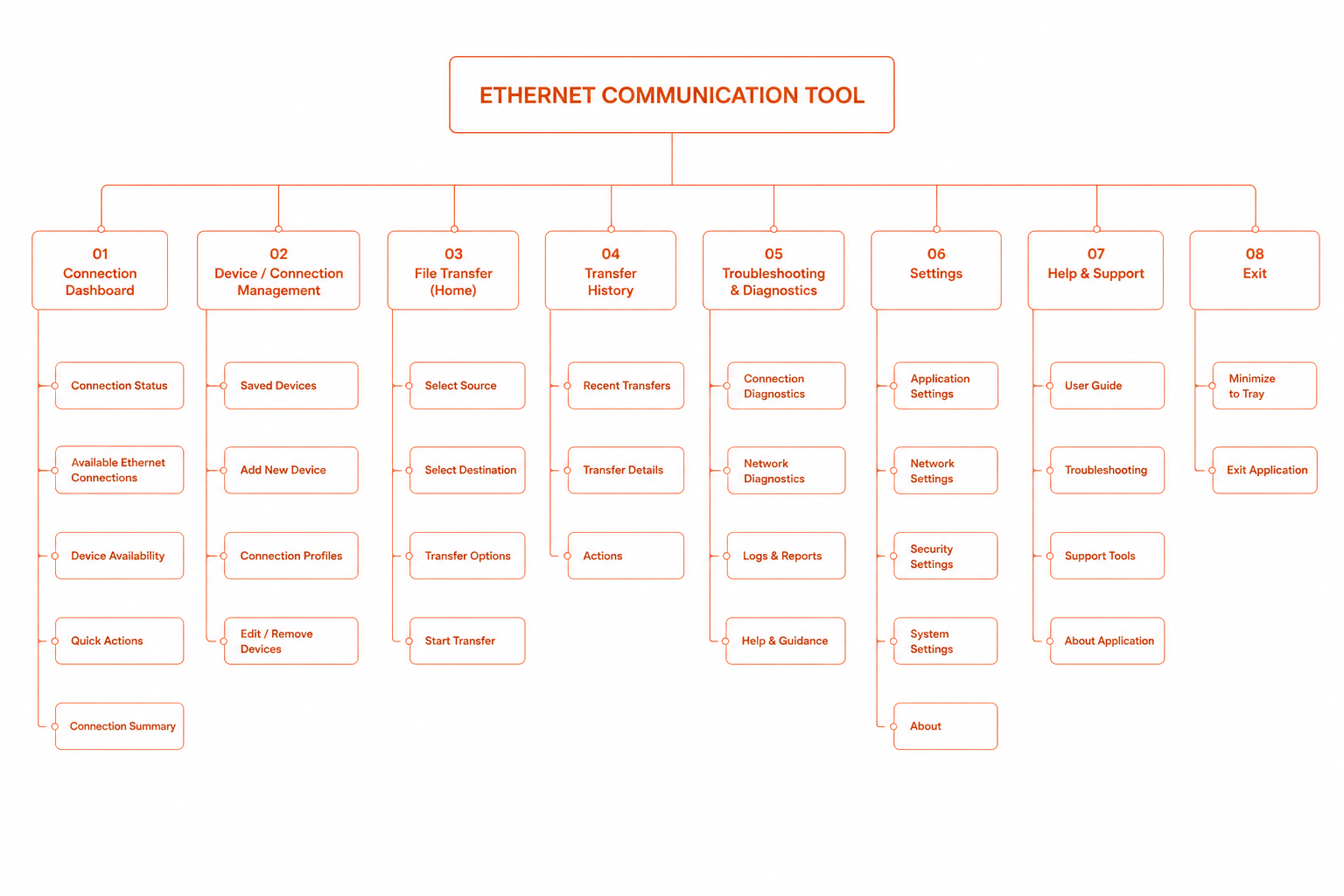
Understand → recover → continueThe architecture follows the same task-oriented mental model, moving users from connection awareness to device selection, file transfer, and confirmation.
I replaced the technical adapter list with clear connection cards, making the most relevant status information easy to scan and act on.
Instead of simply showing what was missing, each empty state explained the situation and gave users a clear next step.
The workflow made the source, destination, and data explicit, giving users confidence before starting a transfer.
Users could see what was being transferred, where it was going, and how the operation was progressing in real time.
Error states focused on what happened and what to do next, helping users recover without relying on technical troubleshooting.
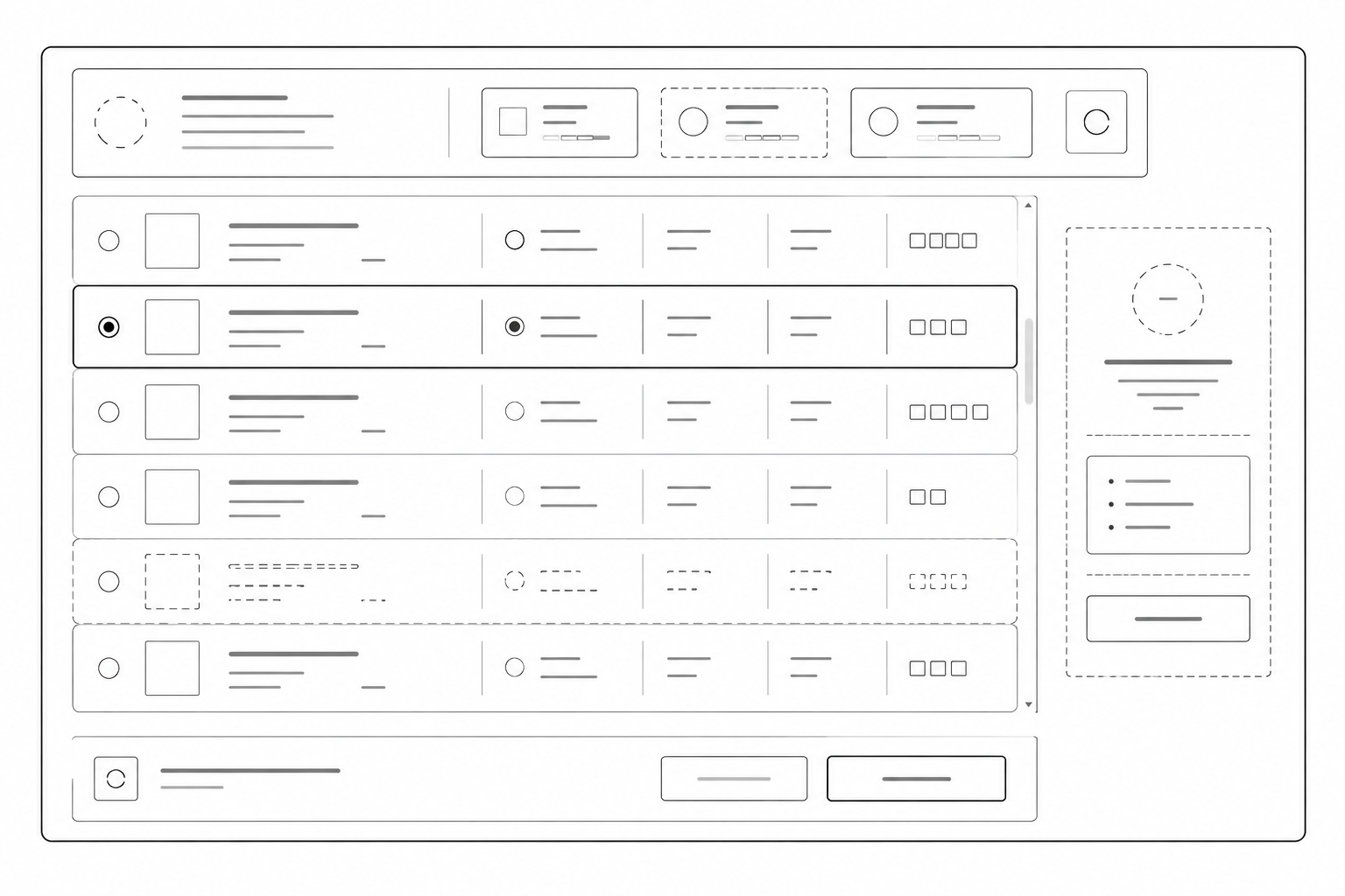
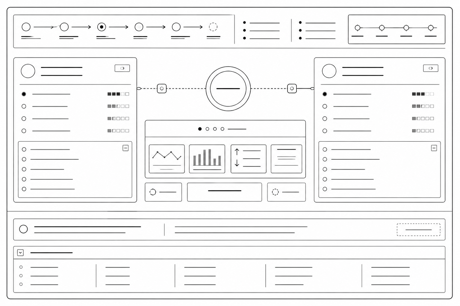
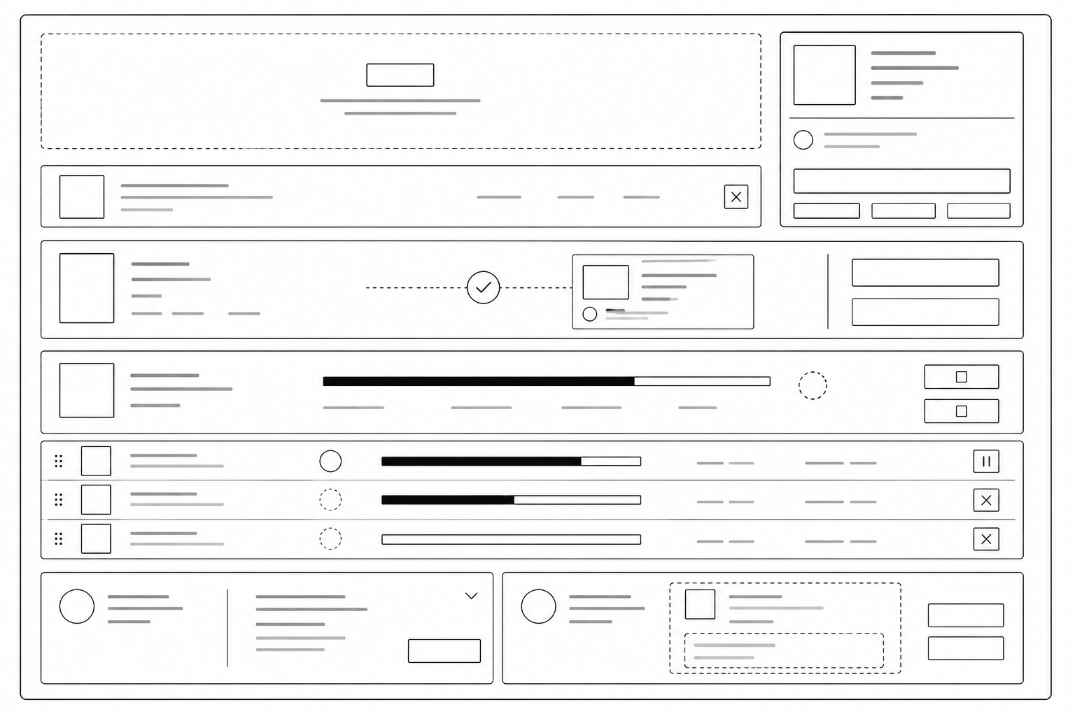
The wireframes established the structural foundation for the workflows, and audit experience before moving into high-fidelity design.
The visual system was designed to reduce cognitive load while making system status, actions, and feedback immediately clear.
Rather than adding visual complexity to communicate technical functionality, I used hierarchy, spacing, typography, and restrained colour to make important information easier to understand.
Remove every element that does not support a user action.
Every element has a clear and singular purpose.
Status and information should be understood at a glance.
Similar actions should always look and behave the same way.
High contrast · Clear typography hierarchy · Large interaction targets · Icons with supporting labels · Status communicated through colour, shape, and text.
A focused component system keeps interactions consistent, predictable, and scalable across the experience.
The design tension
The challenge was not removing technical information. It was deciding when and where that information should appear.
Keep the primary workflow focused on the task while making deeper technical information available when users need it.
Information users need to understand the current state and complete the task confidently.
Deeper system information remains accessible for troubleshooting, diagnostics, and expert workflows.
Routine tasks stay lightweight while advanced information remains available without overwhelming the primary workflow.
Final UI
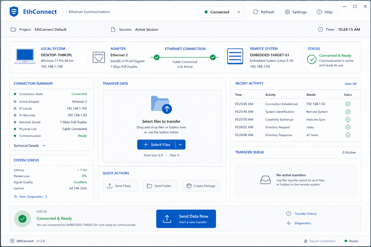
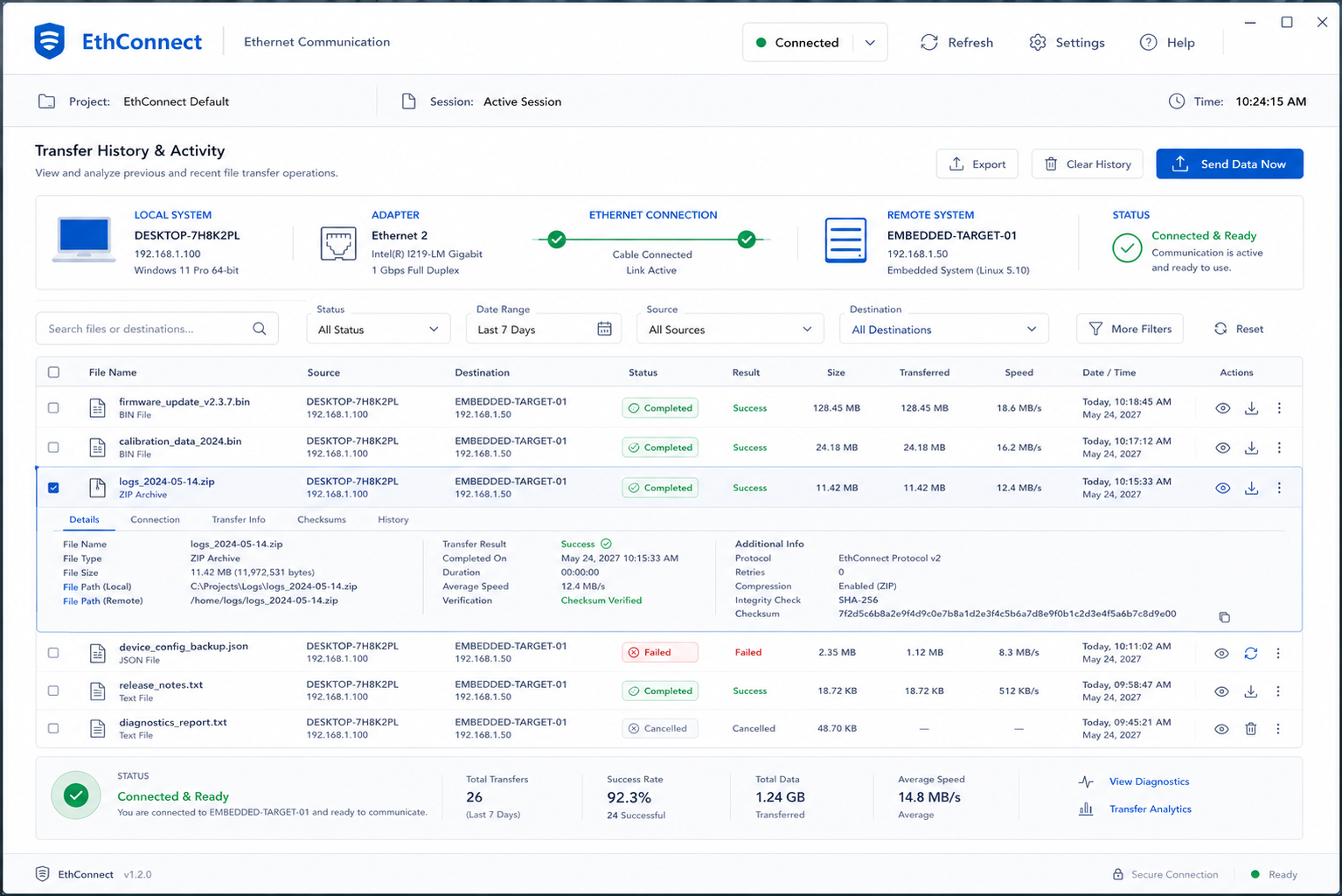
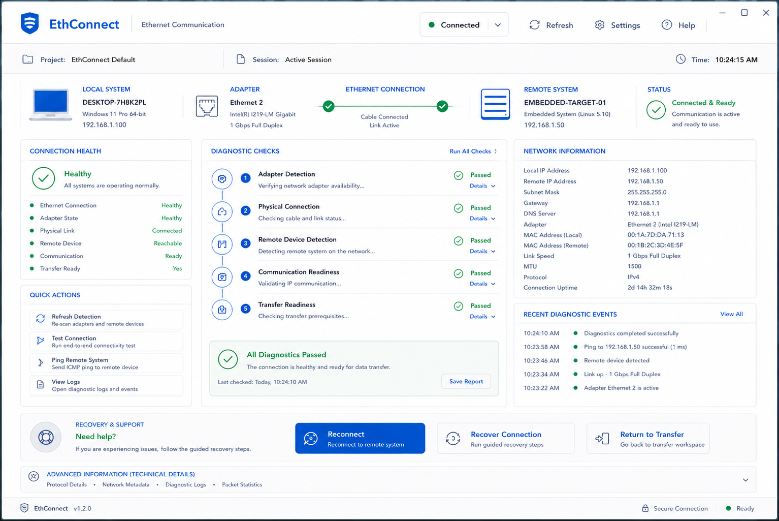
The redesigned workflow was reviewed with end users and stakeholders to evaluate clarity, task flow, and confidence during file transfer.
Reviews confirmed that users could more easily understand the connection, destination, and transfer workflow.
ValidatedUsers had clearer visibility into what was happening, what had completed, and what action was required next.
ImprovedCommon failure scenarios and technical details were reviewed to ensure expert users could still access the information they need.
ReviewedFindings were based on qualitative feedback and review, rather than formal usability benchmarks or quantitative metrics.
QualitativeThe final experience shifted attention away from networking complexity and toward the user's actual goal: connect → select → transfer → confirm.
Search accuracy builds operational confidence: When engineers can instantly filter millions of legacy records, preview complex schematics, and trace revision lineages, unstructured documentation becomes an actionable operational asset.